What does it mean to you personally, to have achieved three reverse designs for The Sovereign?
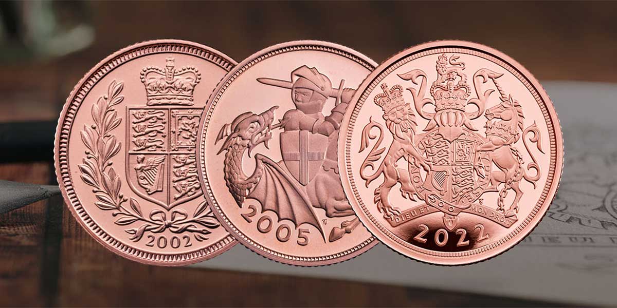
It’s a huge privilege to be chosen three times to design reverses for The Sovereign. The first time was 20 years ago, for Her Majesty The Queen’s Golden Jubilee of 2002, and the second in 2005 was the first new St George and the dragon since Pistrucci’s iconic design. I’m very proud to be making it a hat-trick!
How does this design differ to your previous Sovereign designs?
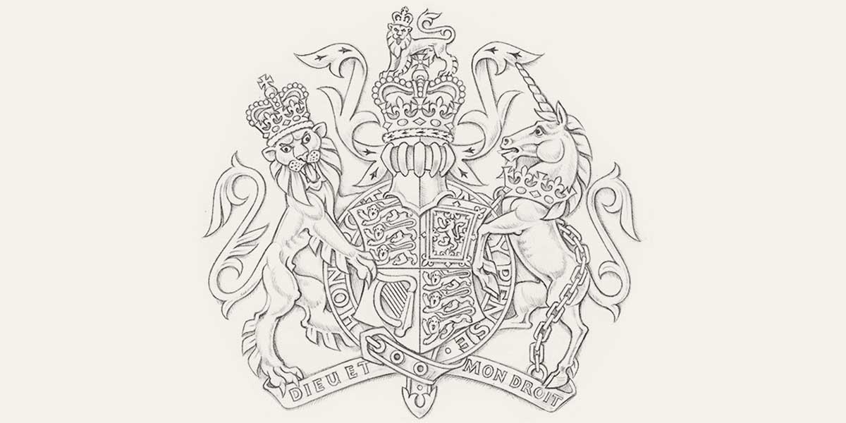
The Golden Jubilee Sovereign showed the crowned shield of the Royal Coat of Arms flanked with laurel branches, alluding to the design of Queen Victoria’s Sovereign. The St George design focused in on the action between St George, his horse and the dragon. The new design shows the full Royal Coat of Arms, so it includes some of the same elements such as shield, crown and heraldic animals, but in a very different arrangement.

How did you approach the initial design concept?
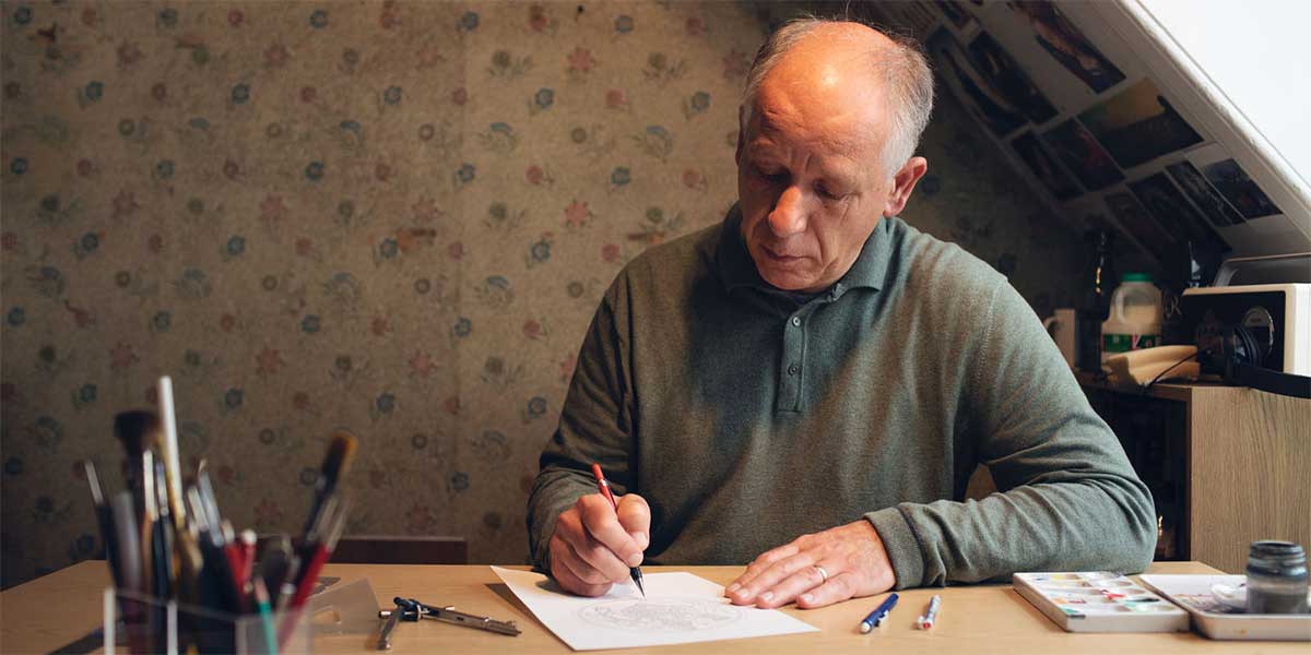
I draw and paint the Royal Coat of Arms many times every year in my work as a heraldic artist, usually on illuminated vellum documents. This means I’m well used to all the elements in the design and how to adapt them for a specific context, such as a coin, without altering the official content. There are many rules and conventions in heraldry, such as the shape of the arches and details of the jewels of St Edward’s Crown. I try to make the lion and unicorn supporters convincing by combining natural history with the stylisation of traditional heraldic design. For example, the lion has ribs and muscles based on a real lion, but his teeth and claws are greatly enlarged to look fiercer, and his mane is arranged into decorative tufts of fur.
Was there anything you knew you wanted to include from the outset?
The design brief suggested using the Royal Coat of Arms, which I have already represented in various ways on coins, including the 2002 Sovereign and the 2015 £1. This time I wanted to use the full achievement, which means shield, helmet with the crown and lion crest, and the lion and unicorn supporters – so there was a lot of detail to include.

Did you encounter any challenges during the process?
As there is a huge amount of detail in the Royal Coat of Arms, some of it gets very small on a coin. I had to give a strong silhouette to the shapes which would show up even when the coin was reduced, and make some of the elements as simple as possible. Within the field of a coin, some shapes, such as the circular Order of the Garter, reflect the overall circle. Others, such as the arch of the motto scroll, contrast with it. Then there are smaller details, such as the tails of the lion and unicorn, and the mantling either side of the crown, which fill in the spaces and incorporate smaller curves, creating harmony within the design.
How was the overall experience of designing a coin for such a historic royal milestone?
It was thrilling to be asked to submit designs for The Sovereign once again. The Sovereign is the most special coin in the UK; it represents the pinnacle of minting and has a strong association with the monarch, even in its name. It also has a long history redolent with the names of sculptors and designers like Pistrucci and William Wyon, so I feel very proud yet at the same time humbled to be a part of this legacy. It’s a great honour to be associated with this unique occasion celebrating the long reign of Her Majesty.
